

Airtable Ultimate Token Dictionary
July, 2025
Overview
Airtable acts as a single source of truth that auto-builds token names from structured fields and a status workflow, letting the team find and apply consistent tokens fast.

Problem, Solution and Impact
Problem
Ad-hoc names like btnSmGap vs. button-small-gutter lived in 40 + Figma files—slowing designers, confusing developers, and spawning duplicates.
Slolution
Created a single Airtable Token Dictionary for every color & component token.
Simple workflow: Draft ▸ Review ▸ Approved ▸ copy name into Figma Variable (no fragile auto-sync).
Impact
Naming decision time ↓ 80 % (≈ 30 min → < 5 min).
Inconsistent-token reports per sprint ↓ 75 %.
New-designer onboarding time ½ (3 h → 1.5 h).
Success Criteria
Single Source of Truth: Every color and component token lives in one Airtable table—no duplicates anywhere.
Clear Naming Pattern: All tokens follow component-variant-element-property so designers and devs parse them at a glance.
Governance Workflow: Each token moves Draft → Review → Approved before it can be used in Figma
Fast Retrieval: Team members can locate any token or its value in ≤ 10 seconds.
Future-Proof: Schema supports new brands, dark mode themes, and JSON export for automation later.
Token Categories
Token Categories act like labeled shelves in our system: each shelf stores a single kind of design decision—colors, spacing, motion, and so on. By grouping tokens by purpose, designers and engineers can find the right value in seconds, swap themes safely, and keep future additions predictable.
Category
What it Controls
Color
Brand & semantic palettes
Font
Font family, size, weight, line-height
Space
Core spacing scale
Size
Generic dimensions (icon, avatar)
Border
Stroke width & style
Border Radius
Corner radius values
Gradient
Multi-stop gradients
Shadow
Box/drop shadows
Motion
Easing & durations
Time
Delays
Icon
Icon asset references
Token Taxonomy Essentials
Pattern applied to every token
component-variant-type-element-property-state-direction
Level Breakdown
Component – main UI element (button, input, checkbox)
Variant – size / style choice (small, primary)
Type – special usage pattern (signup-card, only-logo)
Element – part inside the component (bg, stroke)
Property – design attribute (size, gap, padding, color)
State – UI state needing a unique value (hover, disabled)
Direction – spatial orientation when relevant (left, vertical)
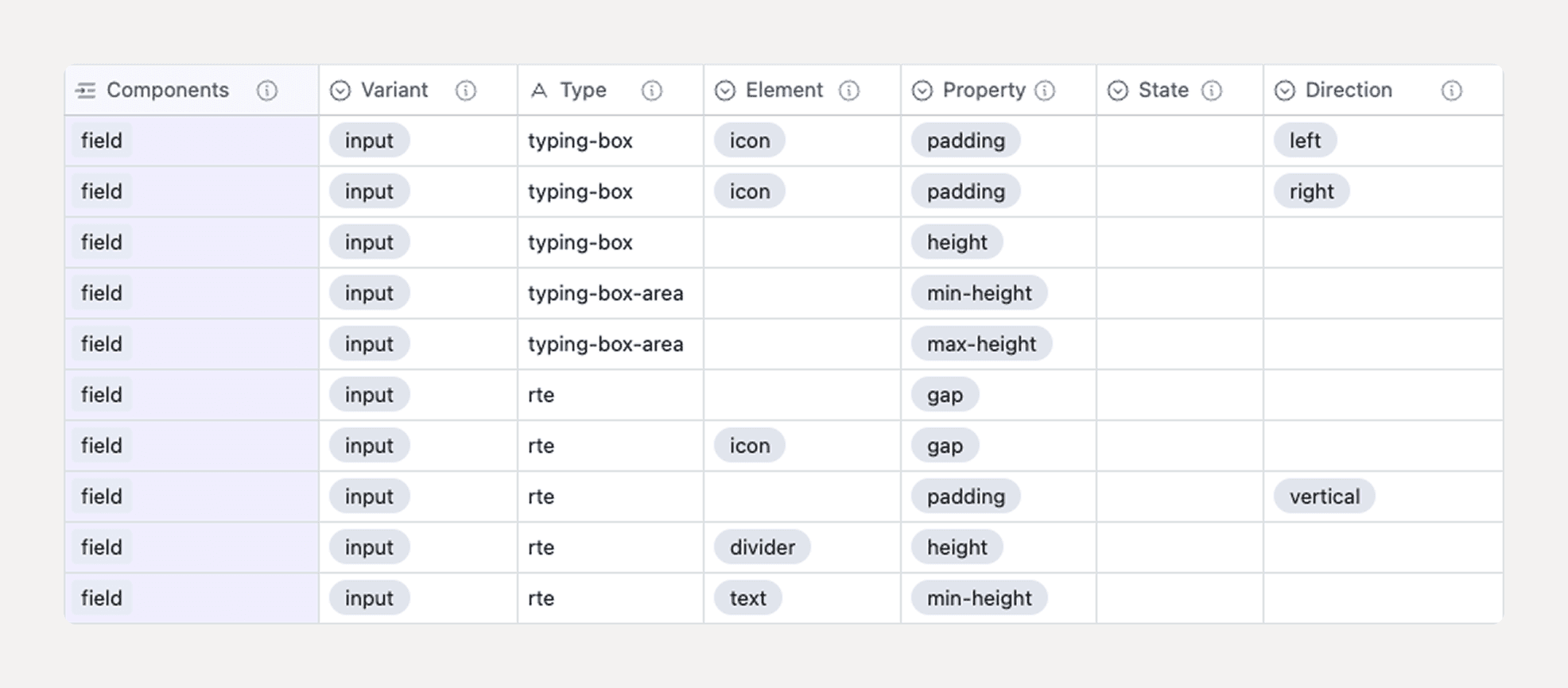
Spacing token example
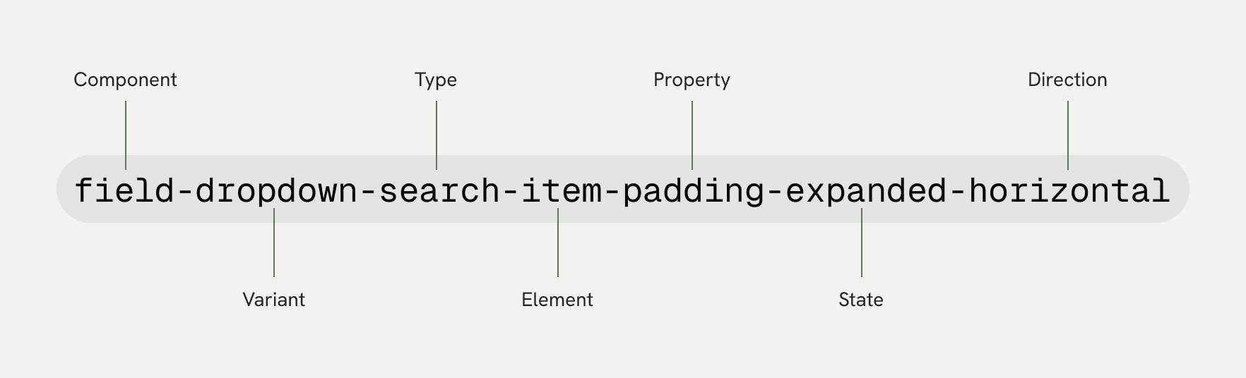
Color token example

Why it works
Seven clear layers let you pack just enough context into each name, keep tokens discoverable in Airtable filters, and future-proof the system for new states or directional rules.
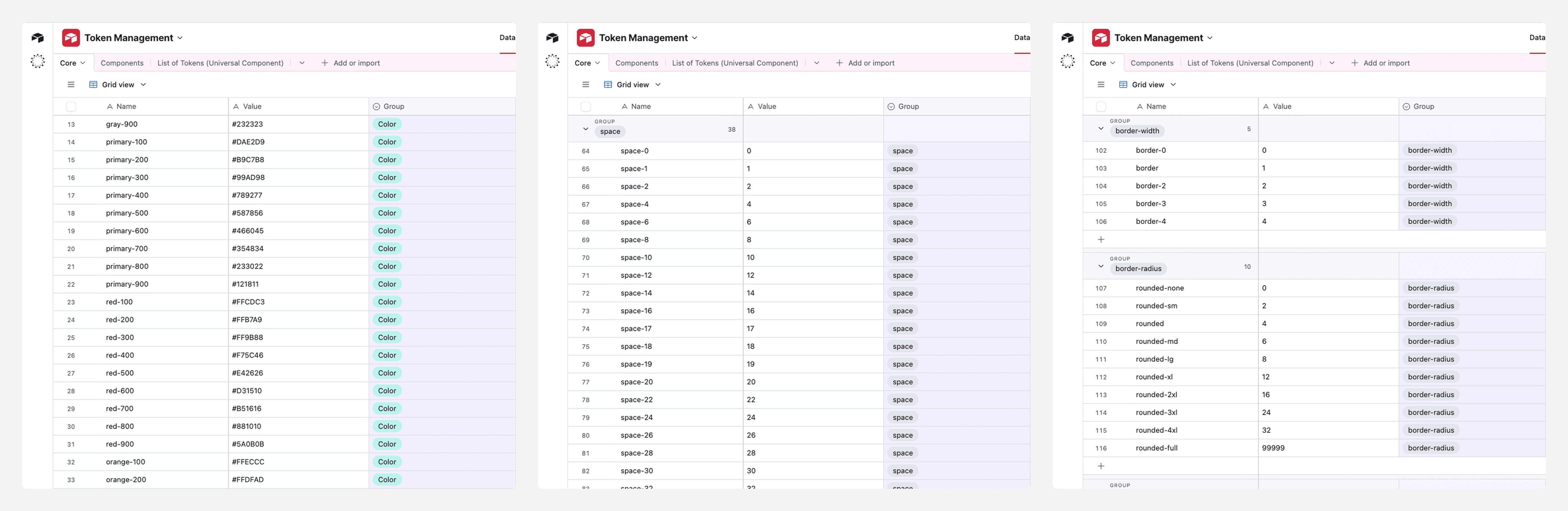
Airtable Schema
Core
This is the foundation layer. Each row represents a primitive token—hex colours, spacing numbers, radii, shadows, and so on. Alongside the token Name, you store its Value and a Group single-select (Colour, Space, Size, etc.). Everything else in the base eventually points back here, ensuring a single source for raw design decisions.
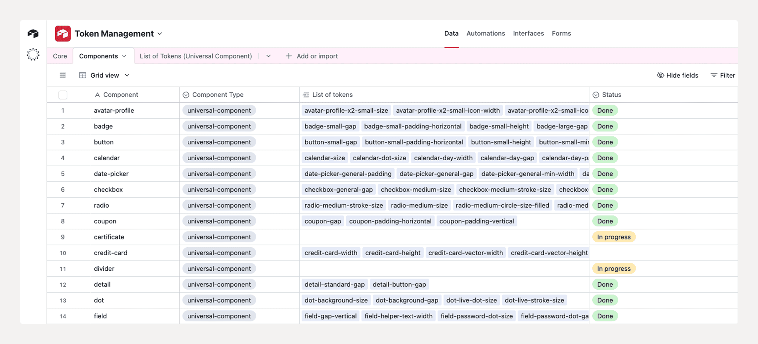
Components
This table does the heavy lifting. Each row is a fully qualified component token such as
Component (text) — the component’s name.
List of tokens (link) — a roll-up of every token the component uses, coming from the next table.
Add a Status single-select if you want to track whether a component is still in to do, in progress, or done.
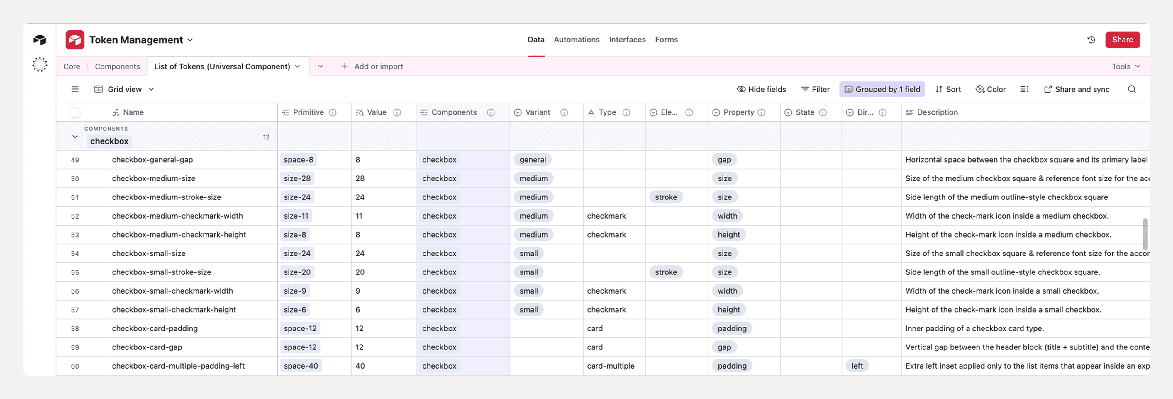
List of Tokens (Universal Component)
This table does the heavy lifting. Each row is a fully qualified component token such as
field-dropdown-item-padding-hover-horizontal
You break the name into seven single-select columns—Component, Variant, Type, Element, Property, State, and Direction—plus a link back to its Primitive in Core. The Value is pulled in automatically via a lookup, giving instant traceability from component token to raw colour, size, or radius. A Description long-text field captures context or Figma frame IDs.
Airtable Formula
Self-building Name formula
The primary Name field is set to Formula:
CONCATENATE(Components, IF(Variant, '-' & Variant), IF({Type}, '-' & {Type}), IF({Element}, '-' & {Element}), IF({Property}, '-' & {Property}), IF({State}, '-' & {State}), IF({Direction}, '-' & {Direction}))
The Name field is a Formula that follows the exact order of your columns—Component → Variant → Type → Element → Property → State → Direction—so the generated token name always mirrors the field sequence:
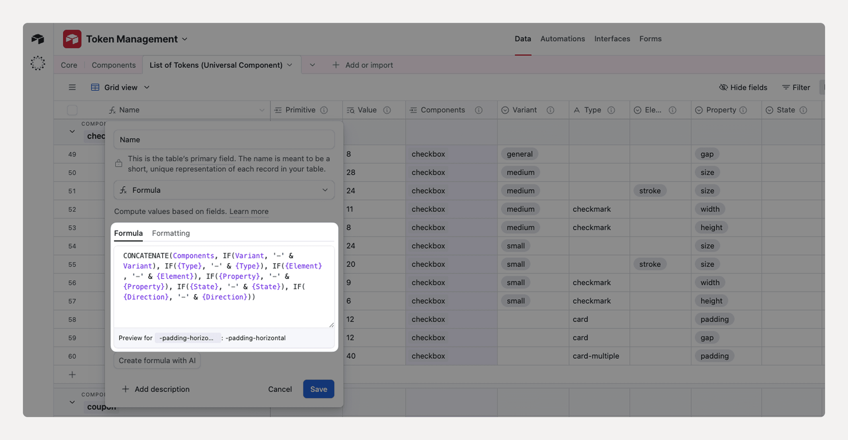
As soon as someone picks values in the dropdown columns, the token name:
checkbox-medium-size
appears automatically, eliminating typos and missing dashes.
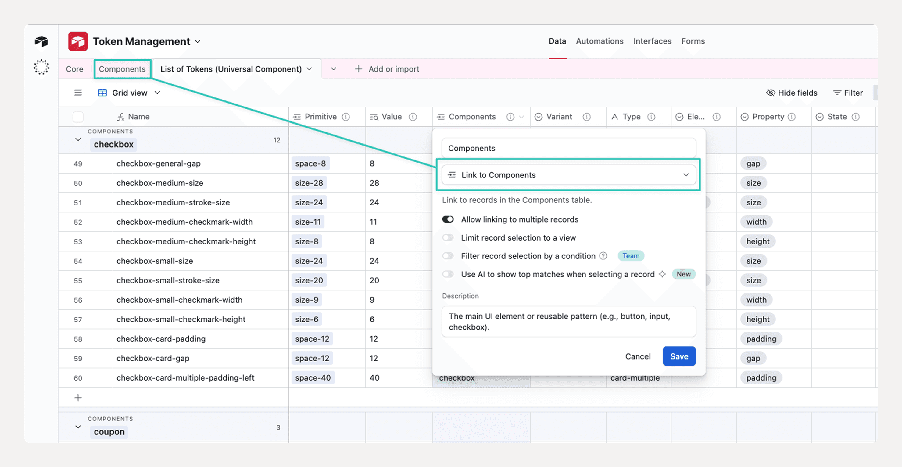
Component field links to the Components table
The Components column is configured as “Link to Components.”
Designers click the cell and choose from the live list of components maintained in the Components table.
On the flip side, each component record immediately shows a roll-up of every token that references it, giving a built-in coverage checklist.
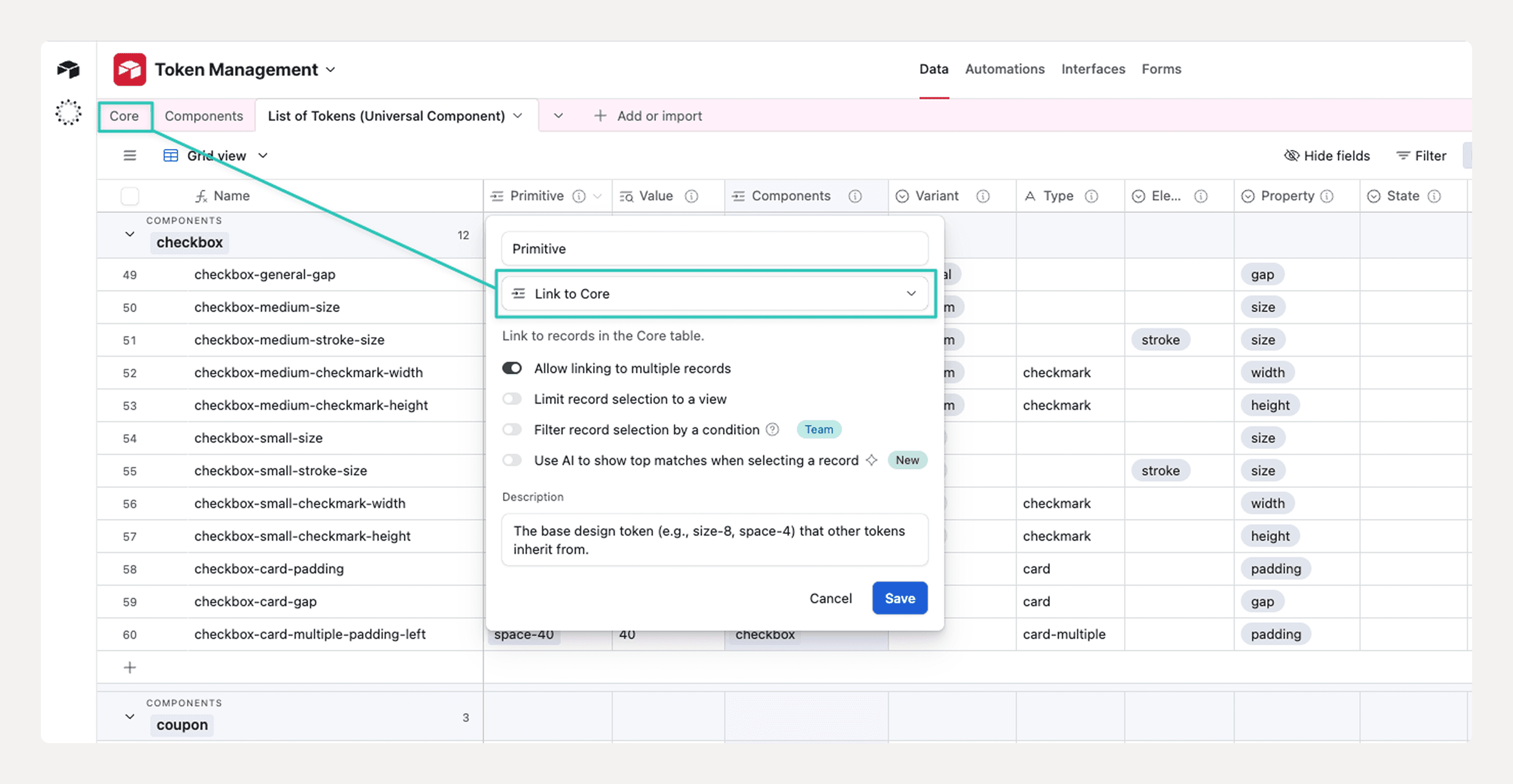
Primitive field links to the Core table
Likewise, the Primitive column is a “Link to Core.”
Selecting a primitive token (e.g., size-8, space-4, color-blue-600) automatically pulls its value into the Value lookup column.
Selecting a primitive token (e.g.,
size-8,space-4,color-blue-600) automatically pulls its value into the Value lookup column.This one-click traceability lets anyone jump from a component token straight to the raw hex, pixel, or radius it inherits.
Lessons & Next Steps
Key Takeaways
Start simple, then scale. Lock the naming pattern first; add layers (state, direction) only when real use-cases appear.
Human-readable wins. Plain-English names beat cryptic abbreviations when onboarding new teammates or debugging.
Governance beats memory. A clear Draft → Review → Approved workflow prevents rogue tokens far better than relying on “tribal knowledge.”
Link back to primitives. Direct connections to Core values make audits and future theming painless.
What’s Next
Automate JSON export—hook Airtable to Style Dictionary so approved tokens flow straight into the codebase.
Add dark-mode primitives—duplicate the Core palette for a “dark” group and map component tokens via themes.
Visual diff testing—integrate Chromatic or Loki to flag UI regressions when a token value changes.