

Building Component Docs for Teams, Not Just Systems
July, 2025
What You Get Back When You Invest in Docs?
For product teams:
Accelerates decision-making by clarifying intended usage
Reduces ambiguity during design reviews and handovers
Helps ensure consistency across journeys and platforms
For developers:
Makes implementation faster and less error-prone
Provides clear expectations for props, behaviors, and edge cases
Reduces back-and-forth questions with designers or QA
For everyone:
Acts as a shared language between design and engineering
Encourages adoption of the design system
Makes onboarding smoother for new team members
Creating useful documentation isn’t quick. It requires structure, planning, and iteration. But once in place, it scales trust, clarity, and delivery across the entire product team.
Documentation List
Overview – What the component is, when to use it, and common scenarios.
Anatomy – Breakdown of the component’s structure and parts.
Variants – Available styles, sizes, and configuration options.
States – Component behavior across UI states (hover, focus, etc.)
Behavior – How the button behaves based on its size and type.
Best Practices – Guidance for choosing and applying the right button type in different UI scenarios.
Do and Don’t – Actionable examples of correct and incorrect button usage to improve clarity, accessibility, and visual consistency.
Responsive – How it adapts across screen sizes.
Changelog – Version history and notable updates over time.
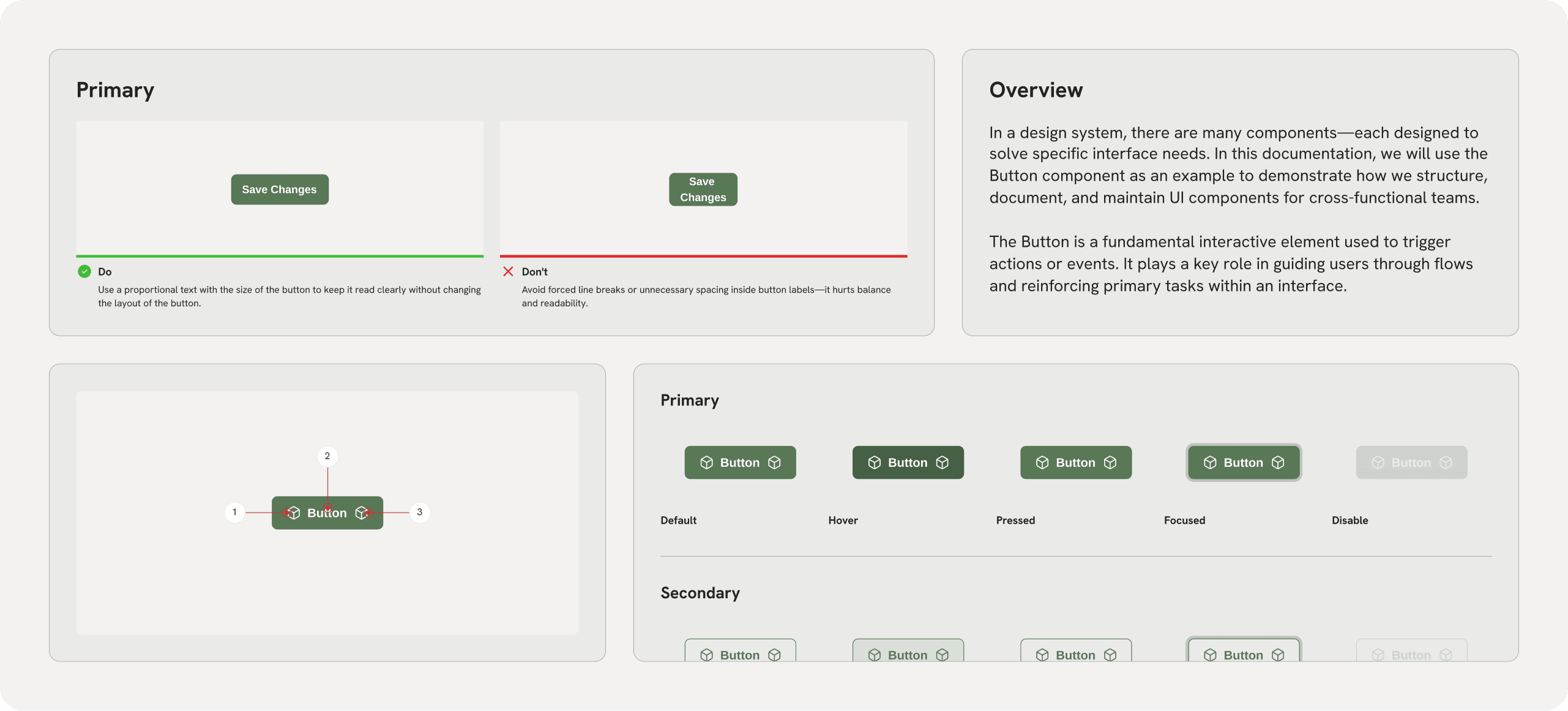
Overview
In a design system, there are many components—each designed to solve specific interface needs. In this documentation, we will use the Button component as an example to demonstrate how we structure, document, and maintain UI components for cross-functional teams.
The Button is a fundamental interactive element used to trigger actions or events. It plays a key role in guiding users through flows and reinforcing primary tasks within an interface.
Anatomy
Understanding a component’s anatomy helps teams align on structure, styling, behavior, and implementation. A well-defined anatomy clarifies how visual and functional parts come together—and ensures consistency across design and code.
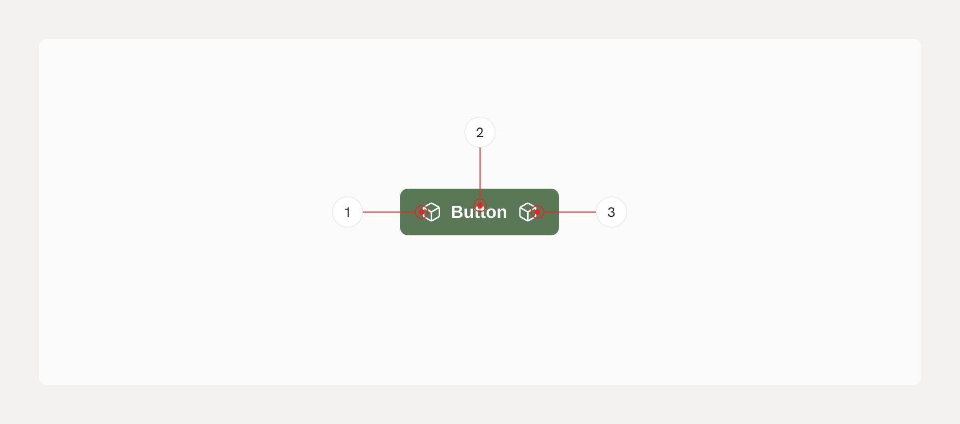
Left Icon (optional) – Supports the button label with a visual cue (e.g. icons like plus, back, edit).
Label – Describes the action clearly and concisely.
Right Icon (optional) – Adds complementary meaning or direction, commonly using arrows or dropdown indicators.
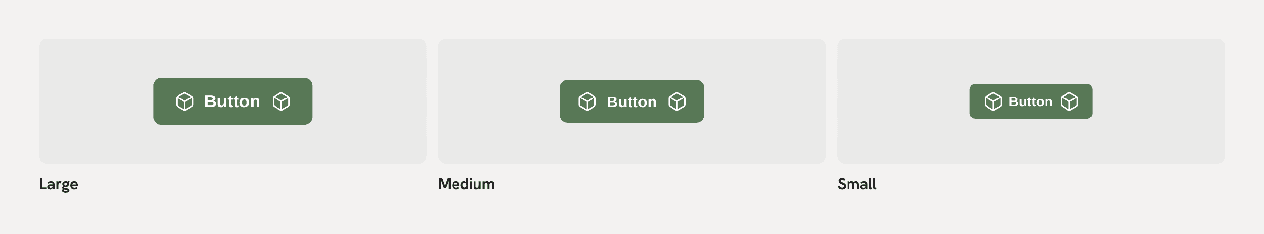
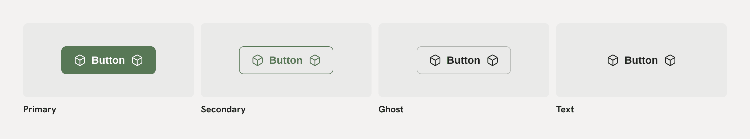
Variants
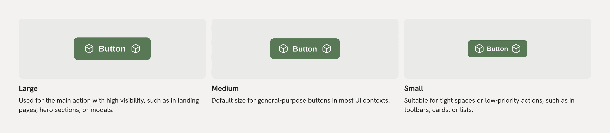
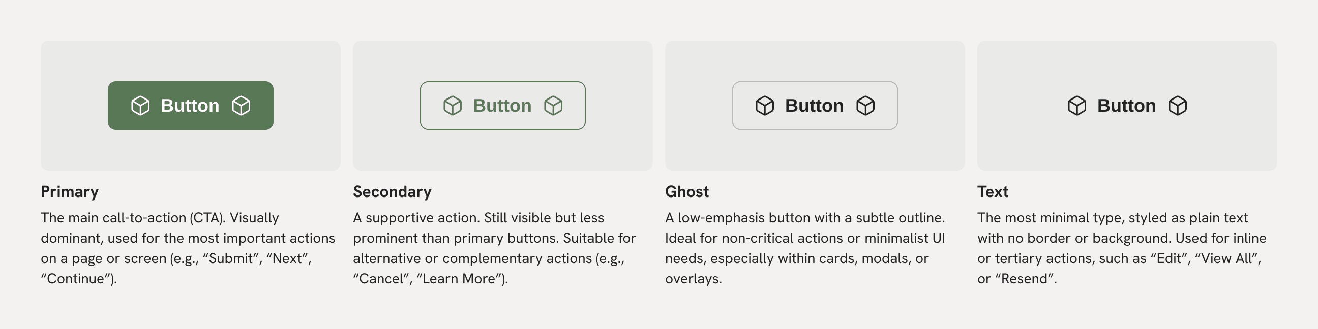
Buttons come in multiple variants to support different use cases, levels of emphasis, and layout constraints. Variants are grouped by Size and Type.
Size
Choose the size based on the button’s importance and the space available in the layout.
Type
Each type provides a different level of visual emphasis. Use them to create hierarchy in your interface.
States
Buttons respond to different user interactions by changing their visual appearance. These states provide feedback, improve usability, and support accessibility.
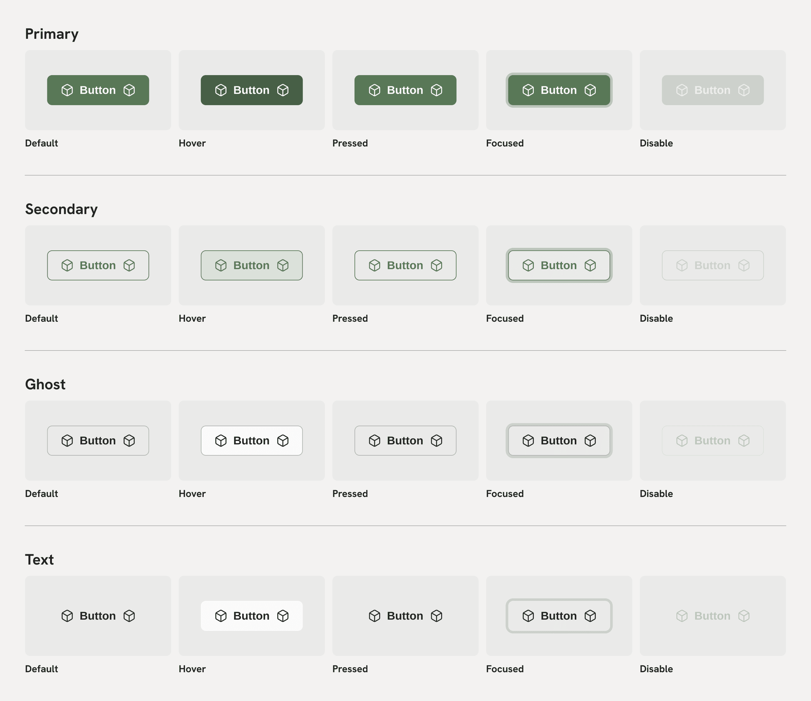
Default
The normal appearance of the button when it is rendered on the screen and not being interacted with.
Hover
Shown when the user’s cursor hovers over the button.
Pressed
Displayed when the button is actively being clicked or tapped.
Focused
Appears when the button is in focus—typically via keyboard navigation (e.g., using the Tab key).
Disabled
Used when the button is not available for interaction.
Behavior
This section describes how button behavior adapts based on its size and type. While variants define visual styling, behavior explains how buttons are expected to act or be interpreted depending on their context and configuration.
Size Behavior
Different button sizes serve different levels of prominence and screen contexts. Size impacts not only visual hierarchy, but also layout responsiveness and touch usability.
Type Behavior
Button types define their level of emphasis and visual weight. Each type serves a different role in guiding user actions and establishing interface hierarchy.
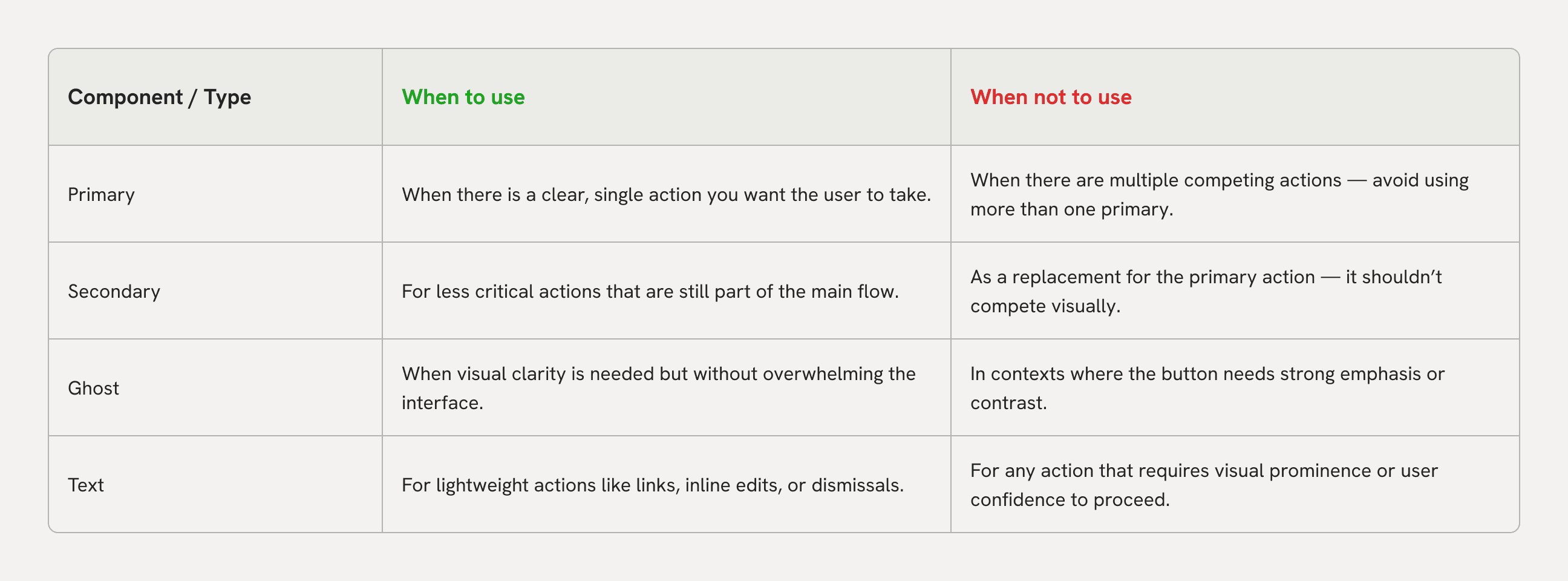
Best Practices
Clear guidelines for choosing the right button type depending on the context. This helps ensure a consistent user experience, avoids visual clutter, and reinforces interface hierarchy through proper usage.
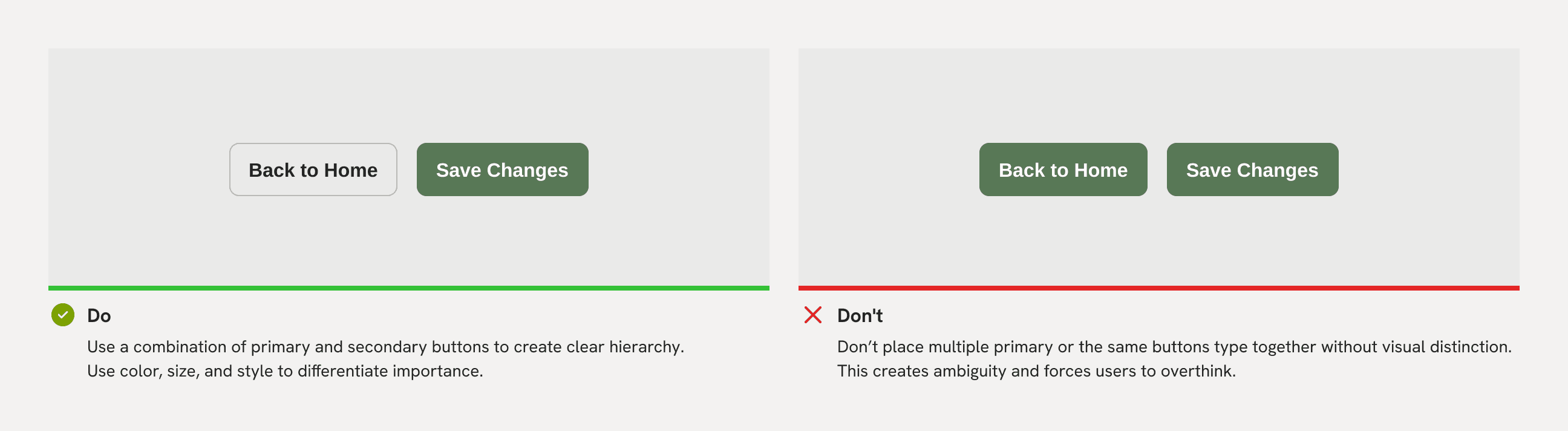
Do and Don’t
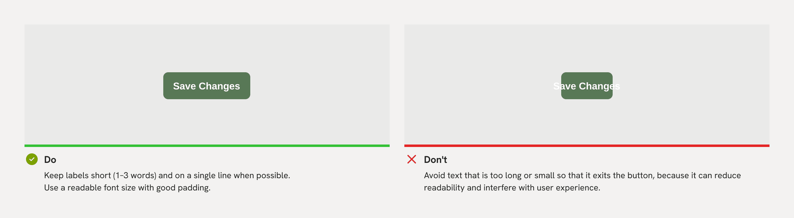
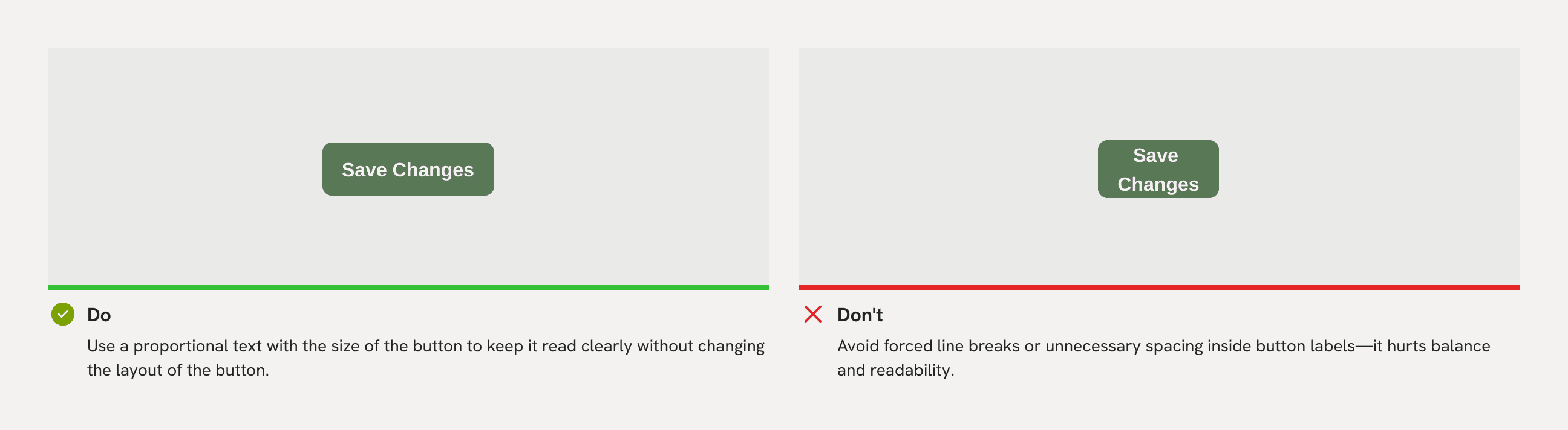
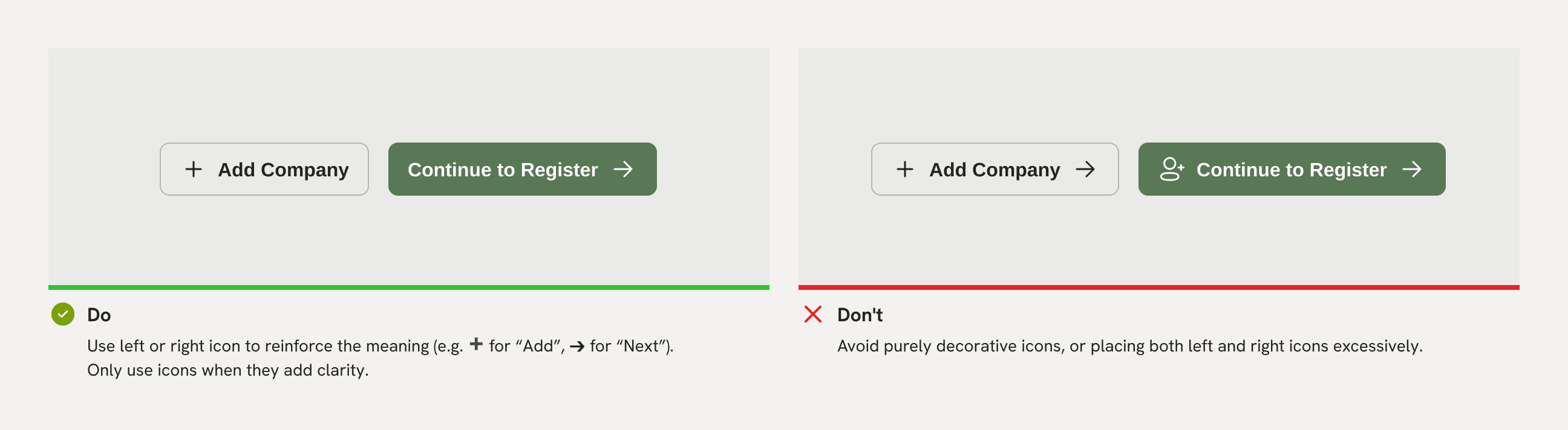
Buttons should be used intentionally to help users take action confidently and consistently. Below are best practices (Do) and common mistakes (Don’t) when designing and implementing buttons.
Visual Hierarchy
Label Length & Proportion
Line Breaks in Text
Icon Usage
"These guidelines help ensure buttons are used consistently and meaningfully. While the examples here are based on the Button component, usage rules may extend or adapt depending on the component type and product context."
Responsive
Buttons should adapt to different screen sizes and device contexts without losing usability or clarity. A responsive button maintains legibility, spacing, and accessibility across breakpoints.
This documentation is primarily intended for web-based products that use responsive breakpoints. The button component is designed to adapt seamlessly across different screen sizes and container contexts while maintaining usability and clarity.
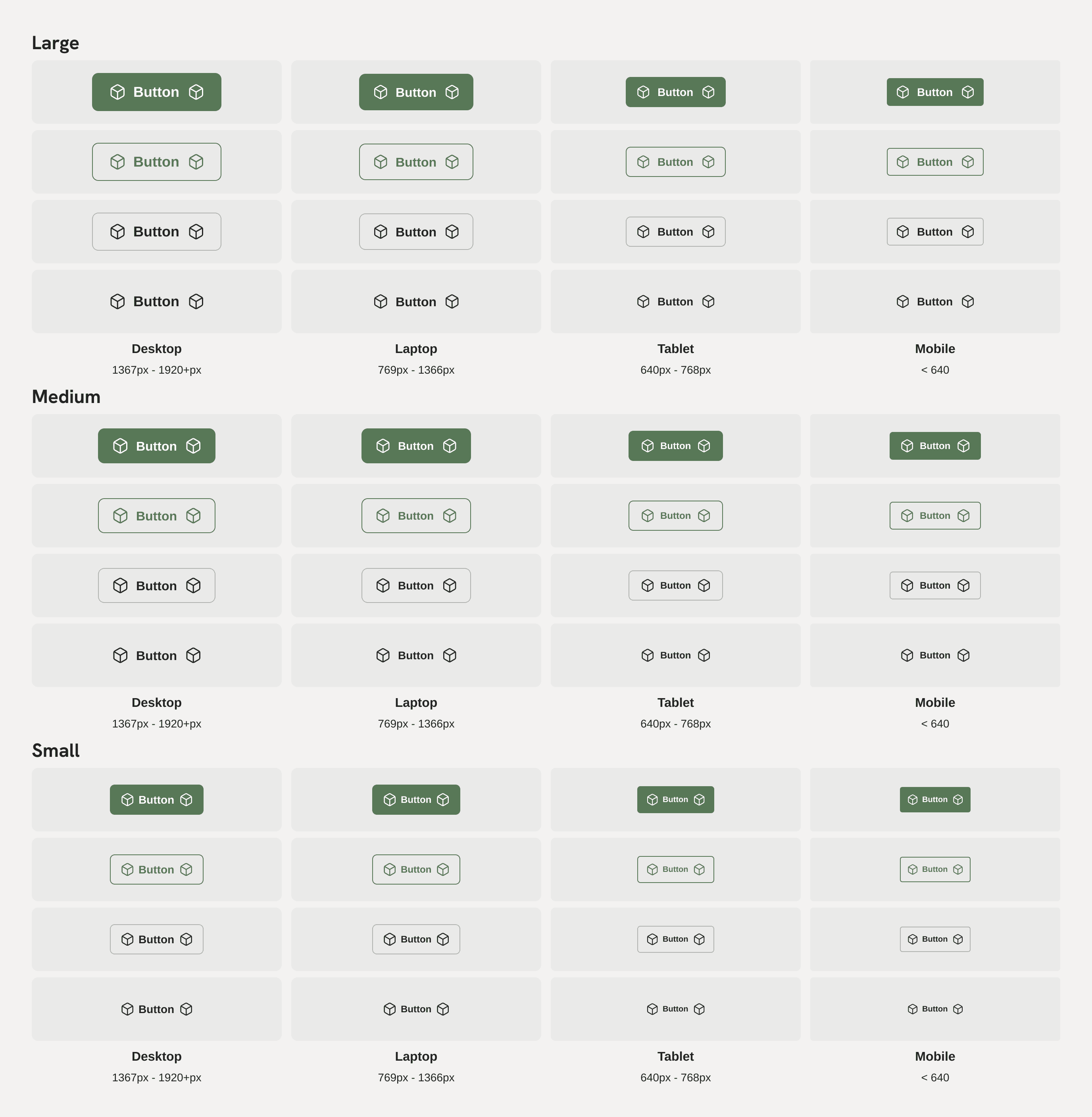
Layout & Size
Button sizes (Small, Medium, Large) should adjust based on the layout context, not just viewport width.
Medium or Small buttons are recommended in compact areas like cards, sidebars, or mobile views.
Full-width Buttons
On narrow screens or mobile, buttons may expand to 100% width to improve tap targets and visual hierarchy.
Common in mobile forms, onboarding flows, and modal footers.
Text Wrapping
Labels should remain on one line if possible. If wrapping is necessary, vertical padding and alignment must remain visually balanced.
Avoid truncation unless absolutely necessary.
Changelog
This changelog tracks all component updates across the design system. Each entry documents the type of component, component name, the nature of the change, and a direct link to the related Figma file.
It serves as a shared reference across design, development, and QA to ensure changes are transparent, reviewed, and easily traceable.
Column Definitions
Date – The date when the change was made.
Component Type – Indicates whether the component is Universal or Specific.
Component Name – The name of the component being changed (e.g. Button, Carousel)
Description – A concise note describing what was added, removed, or modified.
Link – Direct link to the Figma file or frame where the change can be reviewed.