
/An End-to-End
Design System
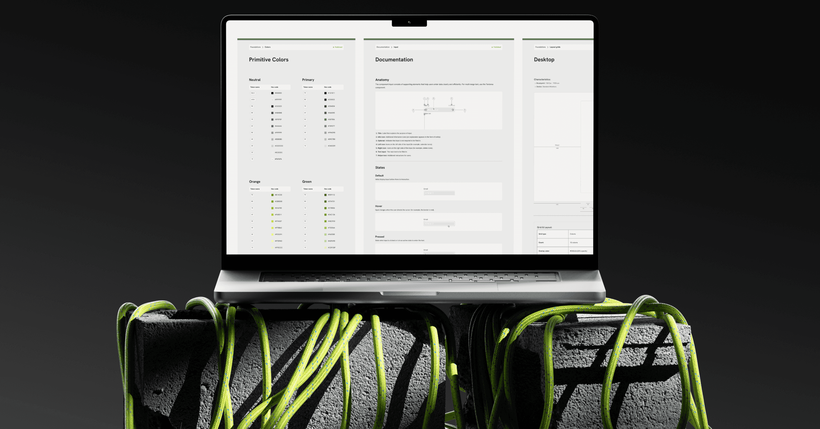
I created an entirely token-based design system in Figma, starting with basic tokens—color, typography, spacing, and motion—and expanding into core, product-specific components.
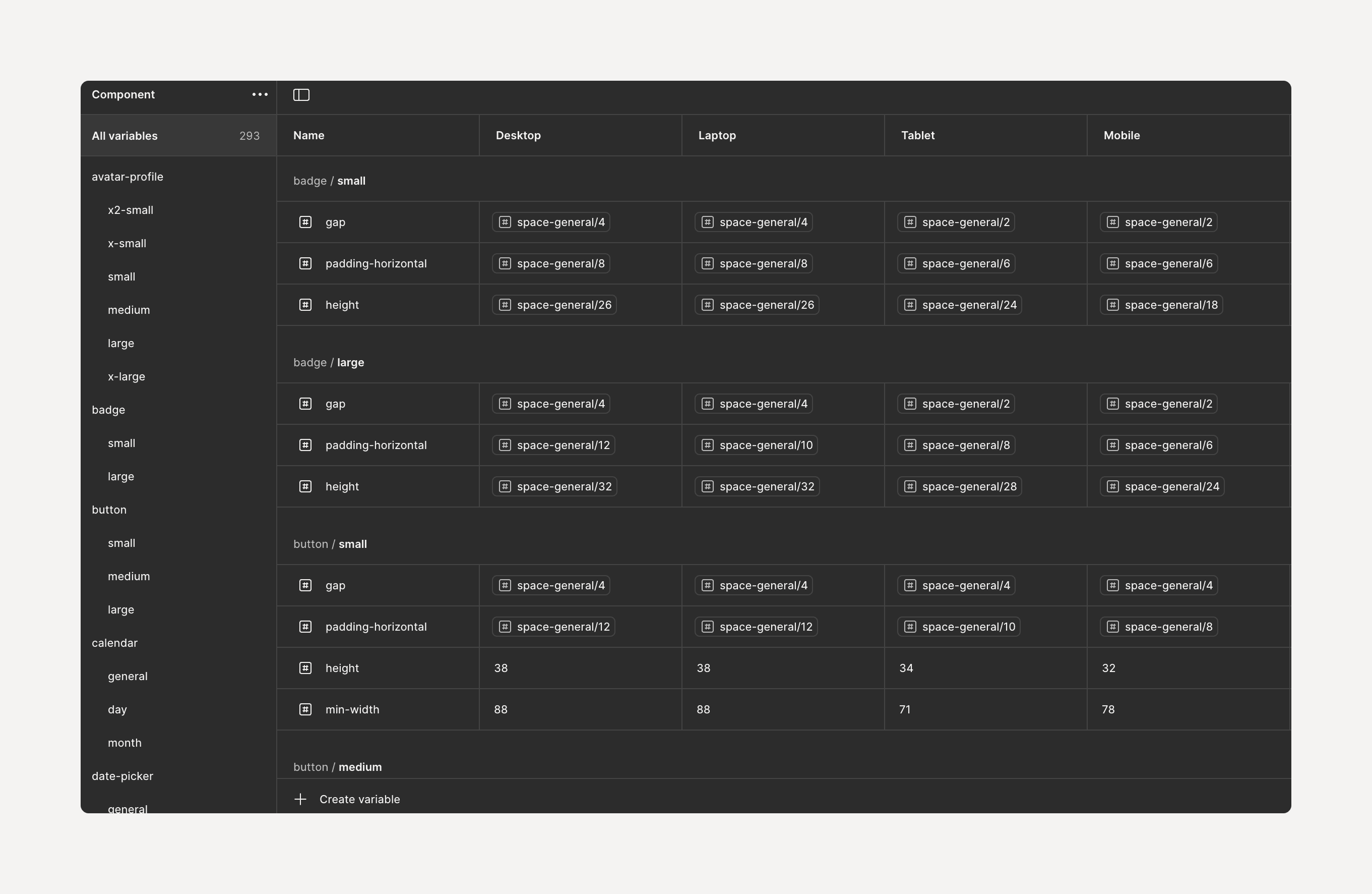
Figma variables form the backbone of the system, allowing each token and component to adapt seamlessly across desktop, laptop, tablet, and mobile devices.
Each component is paired with documentation—an anatomy, a usage guide, and accessibility notes—which co-locates with libraries in Figma to serve as a single, trusted resource for designers and engineers.
Problem
Why our product was slowing down and drifting apart.
Slow delivery — each new page required four artboards and endless nudging across breakpoints.
Inconsistent UI — colours, paddings and icon sizes diverged as the product grew.
Manual maintenance — one component tweak meant hunting down 100+ instances.
Knowledge gaps — designers and engineers often asked, “Which blue is the real blue?”
Solution at a glance
The core ingredients that fixed speed, consistency, and maintainability.
Token foundation — primitive ↔ semantic colours, responsive type scale, 8-pt grid.
Variable-driven responsiveness — one mode per breakpoint, zero extra artboards.
Library split for performance — atoms in one file, patterns in focused files.
Governance & docs — weekly triage, status support, five-part mini-docs.
Challenges
A core pain-point emerged around scalability and iteration: Designing a new page required multiple back-and-forth cycles with other designers, and any change to a shared component had to be applied manually — sometimes across 100 pages — wasting hours and introducing visual drift. The result was an increasingly inconsistent UI and too much time spent on what should have been single-source updates.
Fragmented Token Usage — Without a centralised token library, colour, spacing, and typography values were recreated ad-hoc, leading to subtle visual discrepancies and a ballooning style inventory in Figma.
Responsive Component Overhead — Every page must be meticulously tailored, from the default desktop layout to breakpoints for laptops, tablets, and mobile devices. Without variables, designers are forced to manually change the size and style of each element. Figma Variables are essential, allowing components to automatically adapt across all viewports and eliminating this repetitive work.
Limited Discoverability & Documentation — Team members often duplicated components simply because they couldn’t locate the “official” one or weren’t sure how it should behave, multiplying variations and eroding consistency.
Foundation
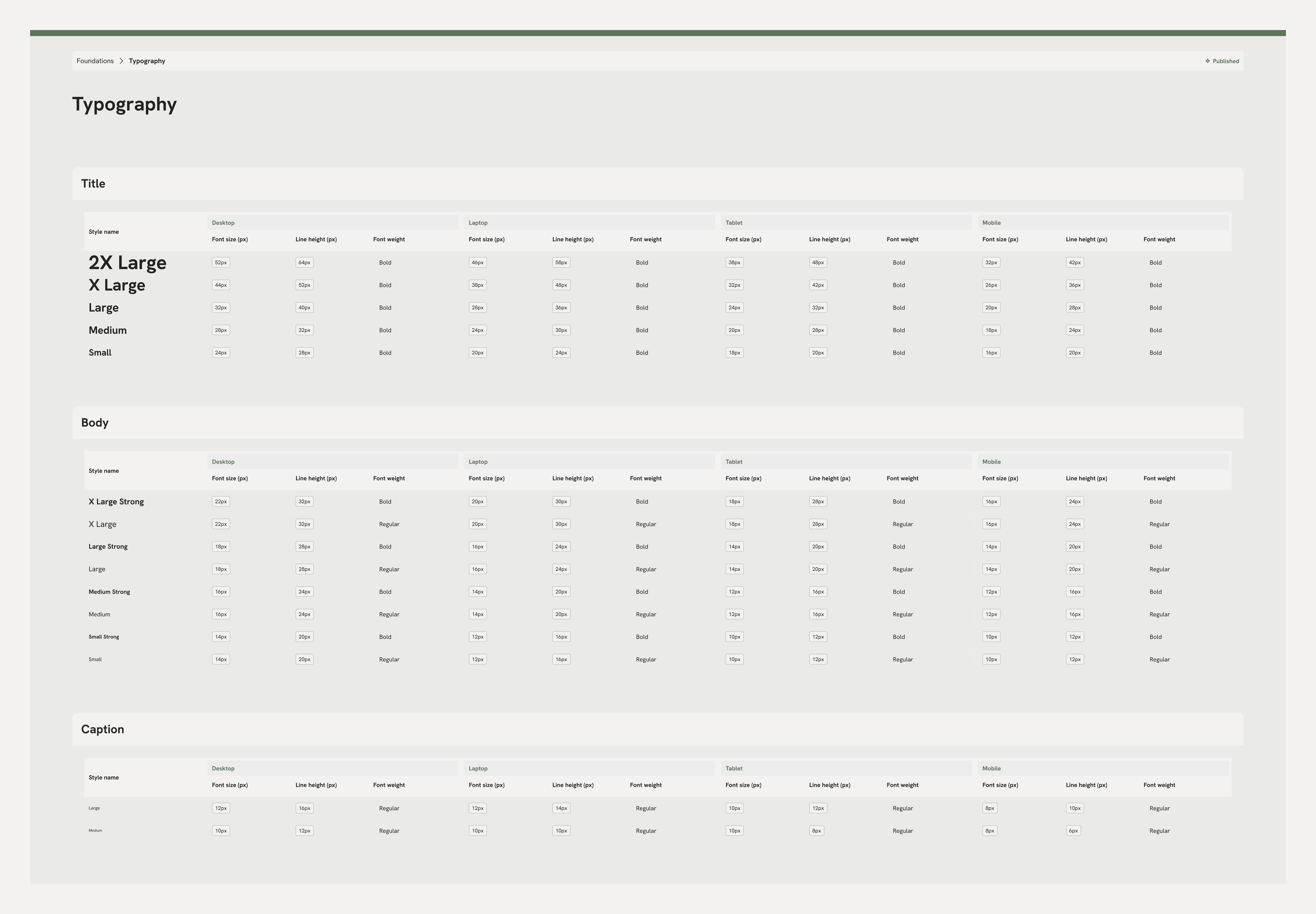
Typography Scale
A responsive type — 24px → 20px → 18px → 16px — auto-adjusts via Figma Variables, keeping hierarchy intact from desktop to mobile.
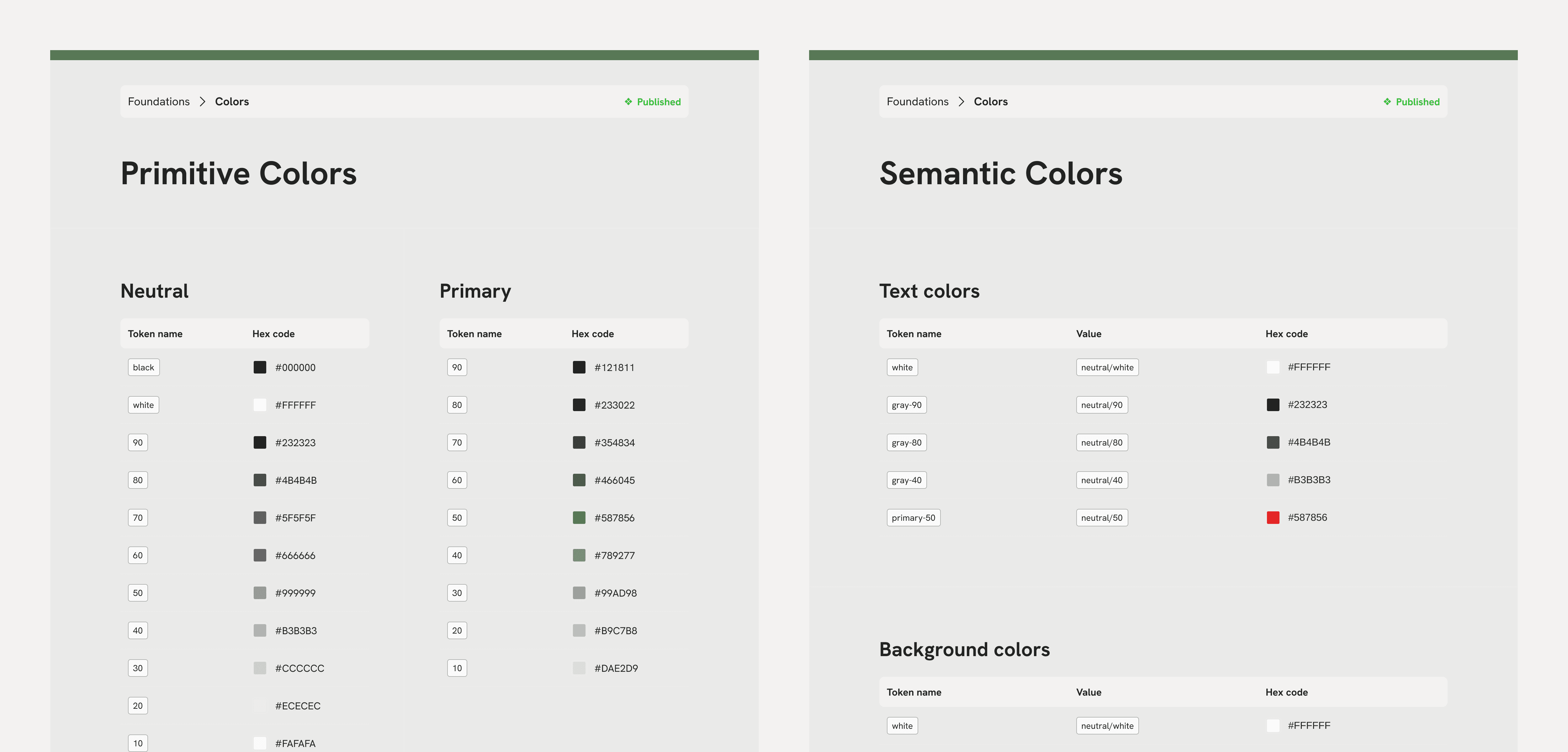
Color Scale
Two layers: Primitive tokens hold raw, brand-agnostic hues (e.g., gray/700, blue/600), while Semantic tokens map UI meaning to those hues (text/default, state/error) — letting themes or dark mode swap colours simply by remapping primitives.
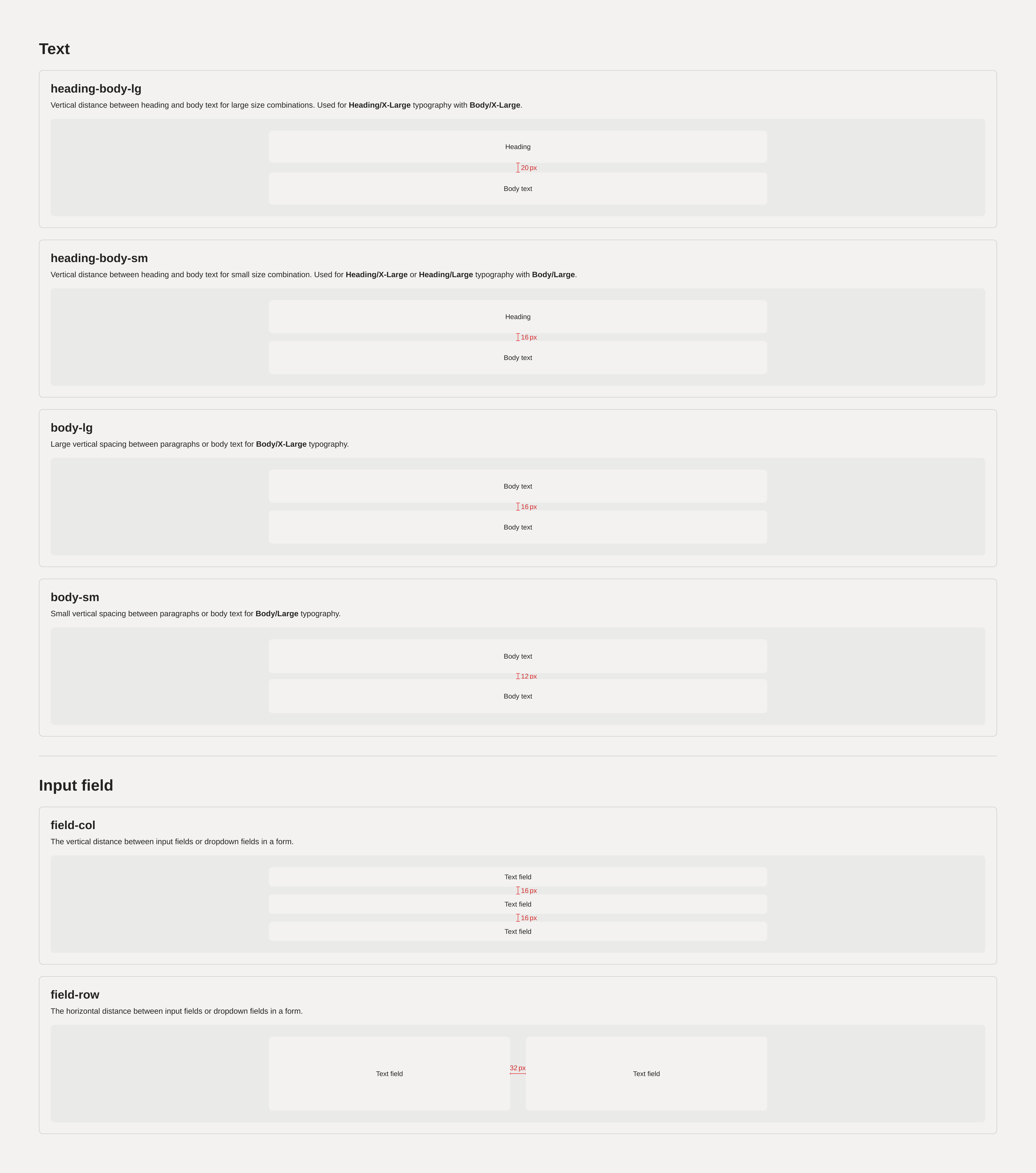
Spacing & Sizing
An 8-px base with Primitive tokens (space/general/8) and Semantic aliases (space/card/horizontal) that propagate updates everywhere with a single edit.
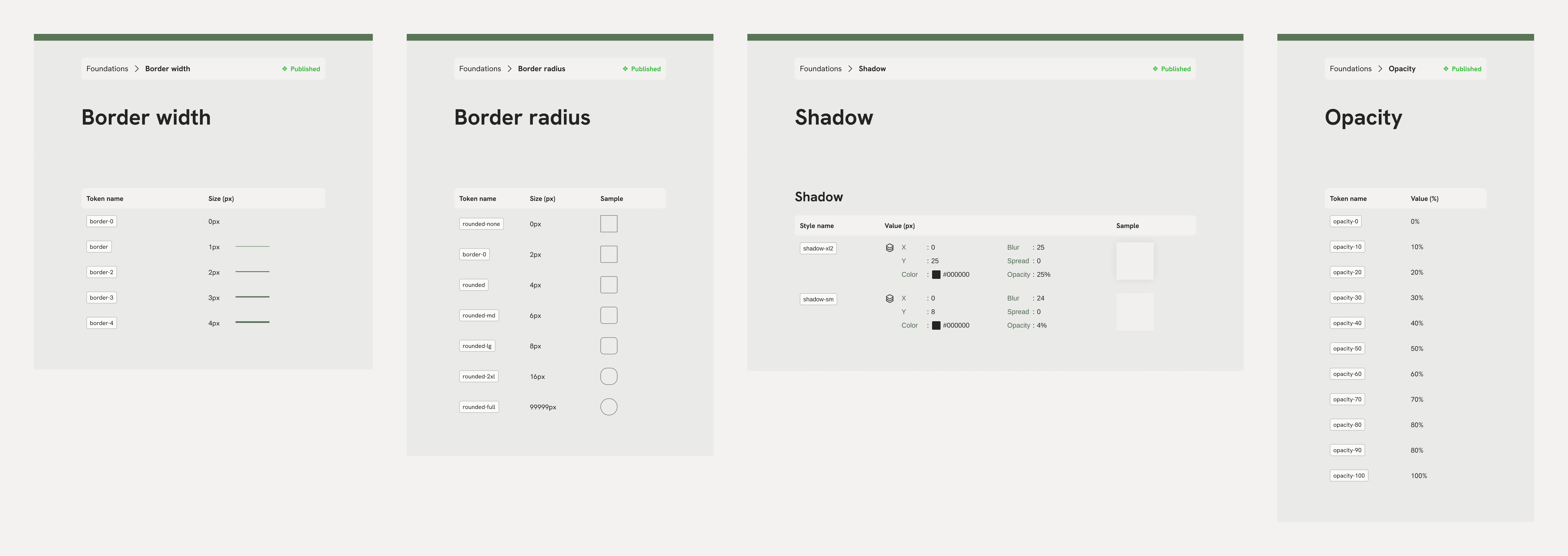
Border Radius, Shadow, & Opacity
Unified elevation and shape tokens (border-2, rounded-large, elevation/3, opacity-70, ) ensure consistent look and feel across states and surfaces.
Breakpoints
Four tokens — desktop 1920, laptop 1440, tablet 768, mobile 390 — drive variable modes so every component responds automatically.
Components & Patterns
Universal Components
Avatar
Badge
Button
Checkbox
Input fields
Etc

Specific Component Library
Card Library
Carousel Library
Popup Library
Data-Visualization Library
Icon Library
Etc
All of these specific components are comprised of universal layers. Separating them into separate files keeps Figma lightweight, allows designers to focus on the right context, and prevents accidental edits to core assets while exploring product-specific patterns.
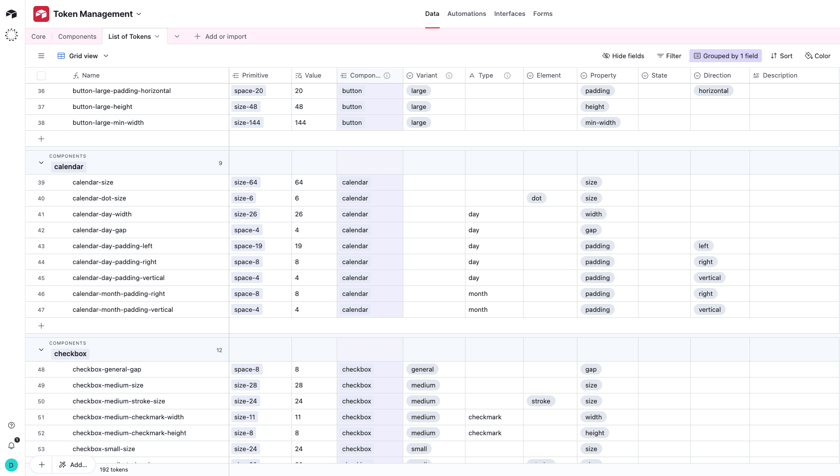
Token Naming & Airtable Workflow
A core pain-point emerged around scalability and iteration.
Single source of truth: All tokens are defined in an Airtable base that captures category, property, and breakpoint values; a formula column auto-generates each final name, so nothing is named by hand.
Formula-driven consistency: Because names are computed, every new token instantly follows the same pattern — no more guesswork or “one-off” labels.
Responsive-ready naming: Only tokens that actually expose multiple viewport values carry a responsive suffix (e.g., padding-horizontal). Tokens with a single value keep a clean, base name, making it obvious when a variable is meant to adapt across breakpoints.
Easy governance & auditing: Airtable lets the team filter, bulk-edit, and version tokens, so design and engineering can track changes or roll back when needed.
Documentation — How Each Component Is Explained
Overview & Variants
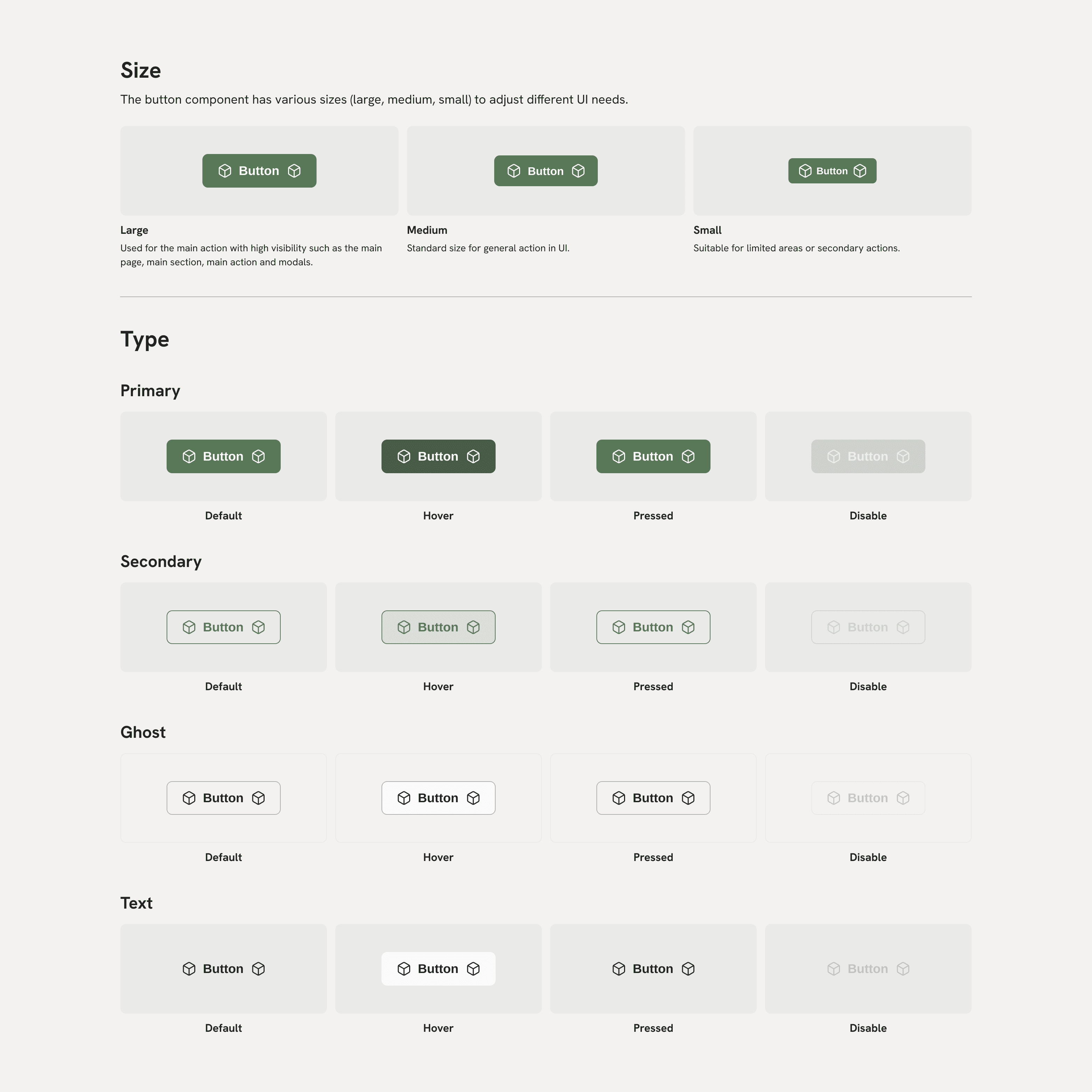
A brief synopsis that lists all available sizes, stylistic variations, and key states (e.g., default, hover, disabled) so teammates can see the full range of options at a glance.
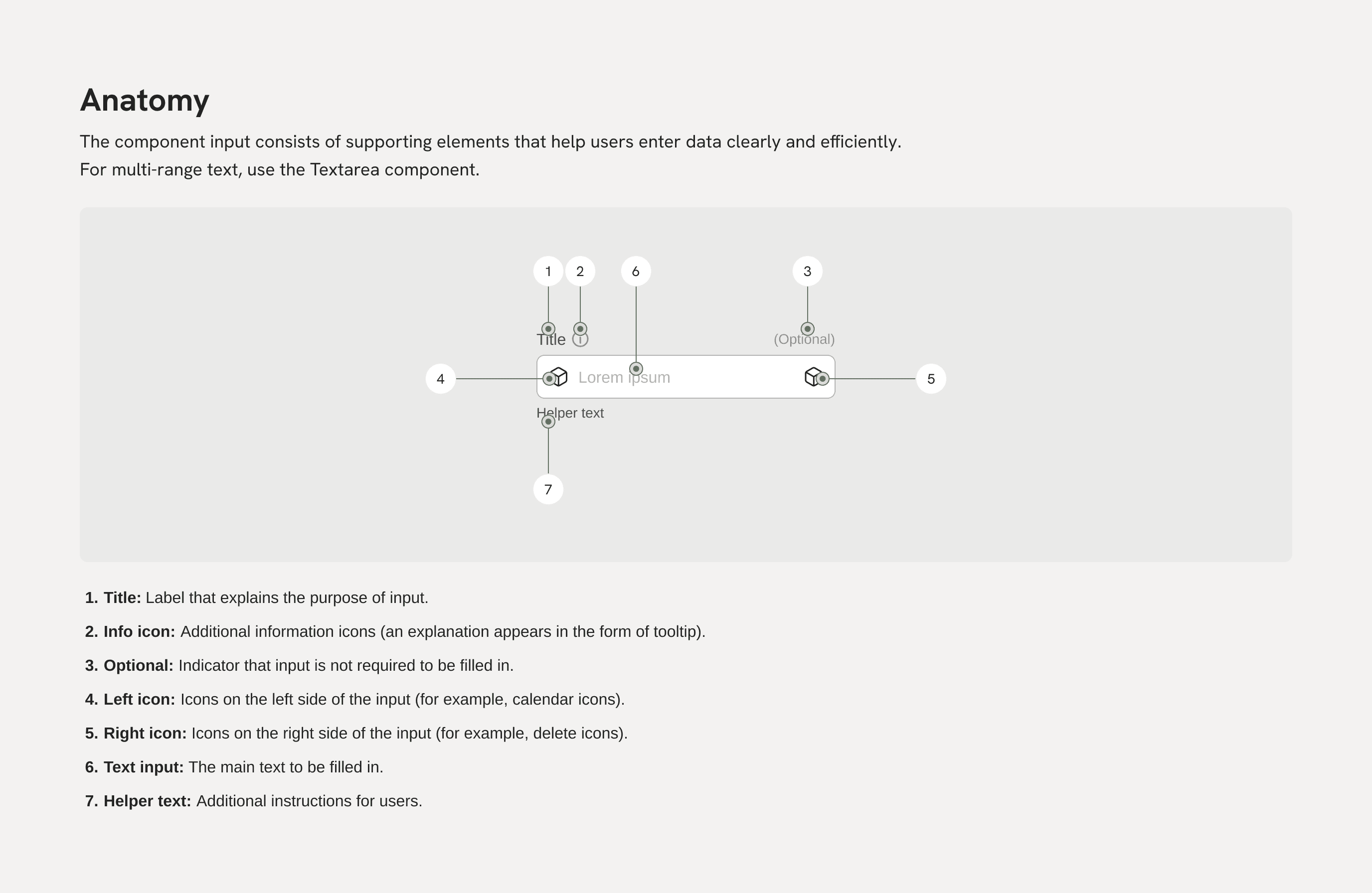
Anatomy
A plain-language breakdown of each functional part — headline, body text, icons, actions — so everyone immediately understands the component’s structure and hierarchy.
Impact & Results
Component reuse is the norm — designers begin with library parts instead of rebuilding, keeping effort focused on new ideas.
Design turnaround is dramatically shorter — tasks that once took one — two days now wrap up in hours, unlocking extra iteration time.
Development flows smoother — code tokens mirror Figma Variables one-for-one, so visual updates reach production with almost no re-work.
Token naming stays consistent — Airtable formulas plus Figma sync eliminate “mystery tokens,” preserve design-code parity, and simplify audits.